
THE ART OF
THE WEST AND THE RUTHLESS
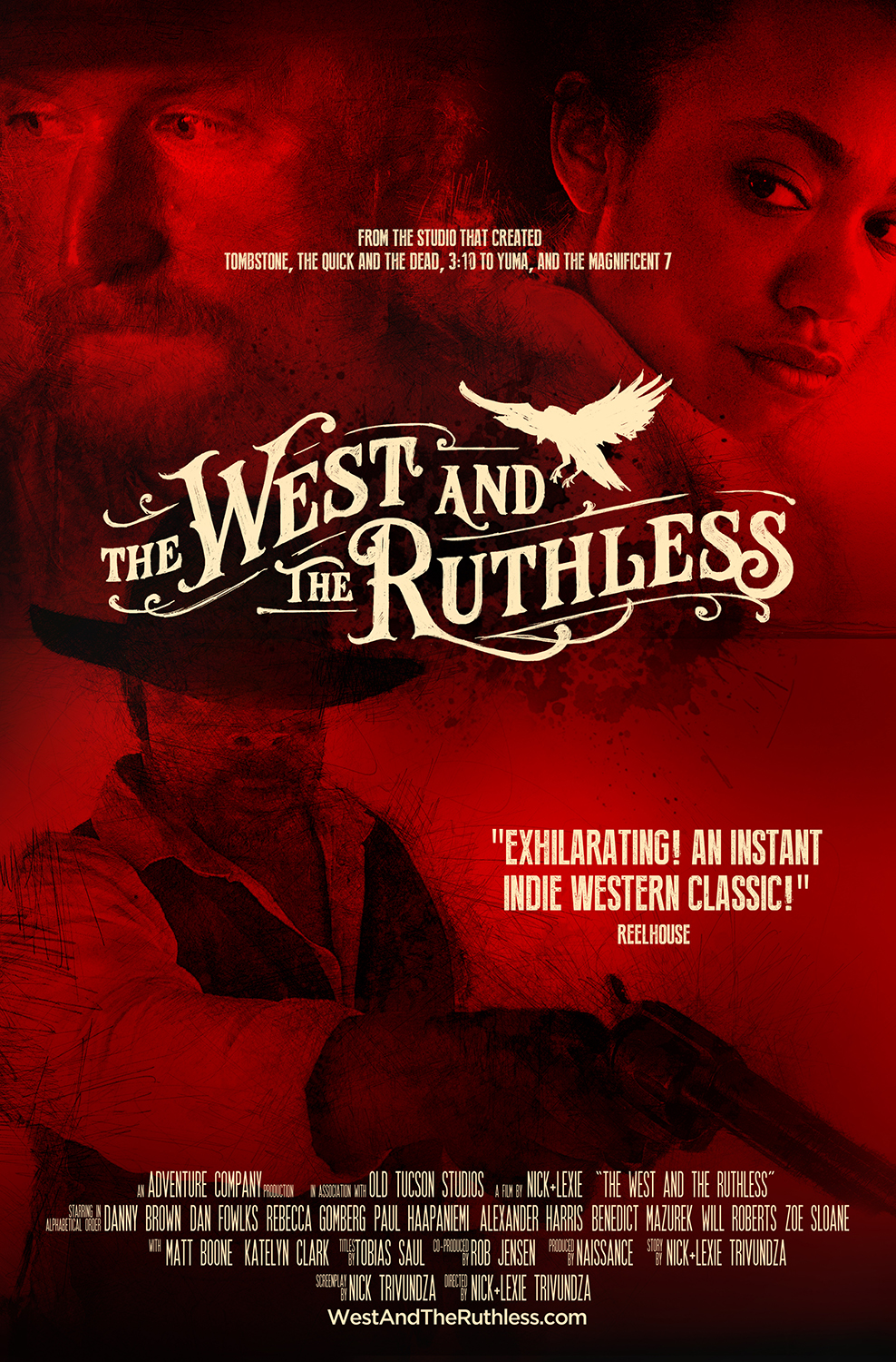
The artwork for the West and the Ruthless, an extremely modern take on the classic western film genre, plays an important part not just in the covers and advertising but also the story itself.
Official COVERs


International Posters


CHARACTER posters


THE WEST AND THE RUTHLESS, main on end
MAIN ON END, STILLS


Pencil over Footage
Each of the Posters, Press Pieces, and End Titles utilize pencil work drawn over frames from the film. Here's an untreated version of the Jacqueline Chaplin image from the International Posters (played by Zoe Sloane).
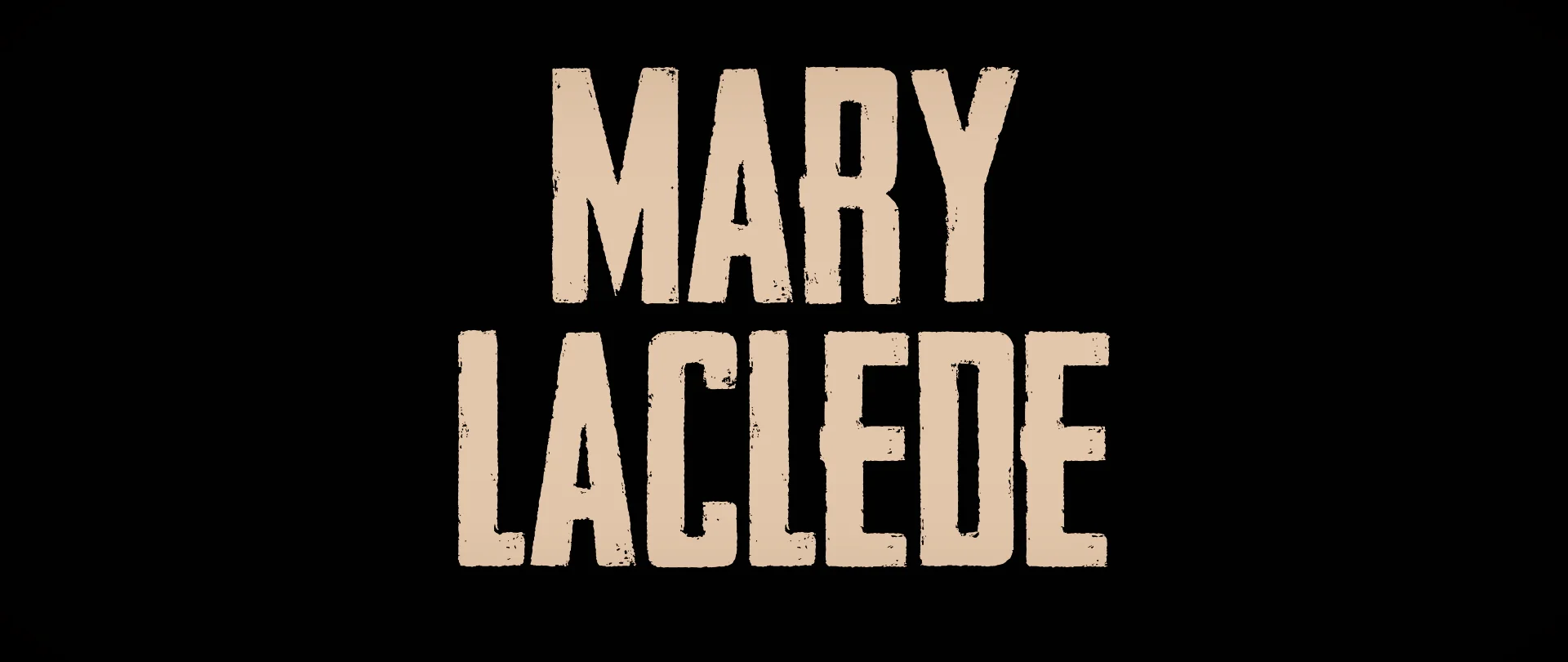
Titles as part of the story
The West and the Ruthless is a non-linear Western, more like GO or Reservoir Dogs than a typical Western. Each of the overlapping storylines are introduced, by the name of the character, and not always in the most predictable ways or places. This is the same style of design used in the Teaser and Trailer for text as well, integrating the storytelling technique and advertising.
THE WEST AND THE RUTHLESS, Teaser trailer

The West and the Ruthless, Official Trailer

The West and the Ruthless, Opening Titles

OPENING TITLES, STILLS


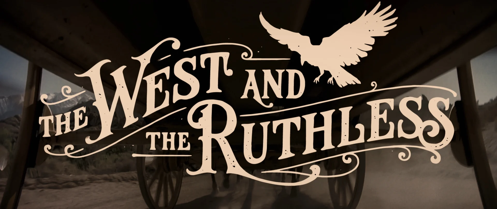
Title Designs by Tobias Saul
Tobias saul, lettering genius
This is the third collaboration between Tobias Saul and directors Nick + Lexie. When they embarked on their debut feature film, Tobias was the only person they felt comfortable enough creating the main logo - something that will be a part of the film forever and in some cases, the first impression someone may have of the film.
This lettering also exits in the film itself on a water tower with the name of the town where the story takes place, "Crows Landing."
Tobias Saul also created the lettering and title design for the studio releasing the film, Adventure Company (www.adventure.company).
For more amazing work by Tobias Saul, check out his website right here:


Tobias Saul also created the hand lettering on the water tower of the town's name, Crows Landing
adventure company


